

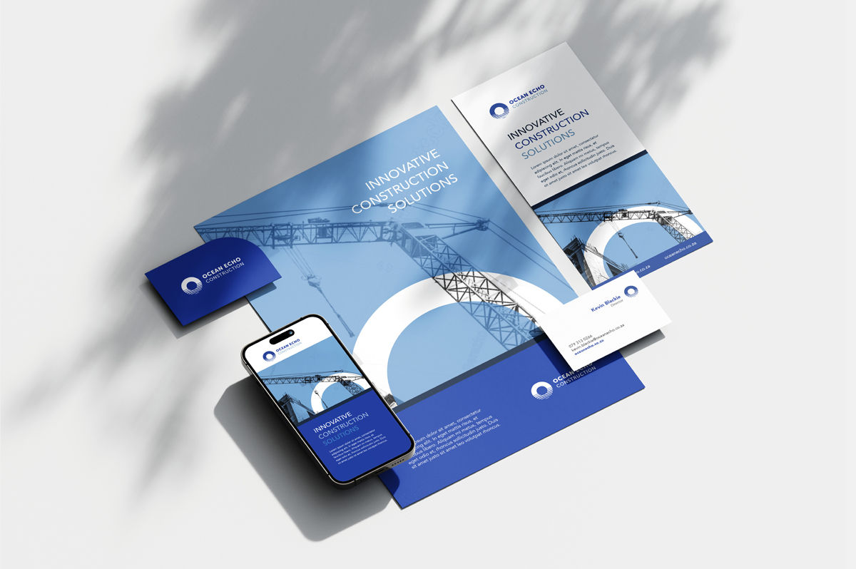


The branding for Ocean Echo Properties was designed to reflect the company’s deep-rooted expertise and longstanding reputation in large-scale commercial and industrial development. The logo symbolises an ocean reflection—capturing the concept of an “echo” across water—while also reinforcing the company’s coastal roots and enduring legacy.
A bright blue palette was selected to evoke reliability and trust aligning with the brand’s professional and forward-thinking approach. Circular elements drawn from the logo are repeated across the visual language, creating a sense of cohesion, flow, and continuity. Altogether, the branding conveys strength, clarity, and confidence, echoing Ocean Echo’s commitment to quality and innovation in construction.
Ocean Echo
Branding - Digital - Print
